Journey Through Nature
Connecting urban families with the outdoors
A two-part system for urban families: an activity book for children and a companion app for parents, validated across two rounds of testing with 10+ parents.
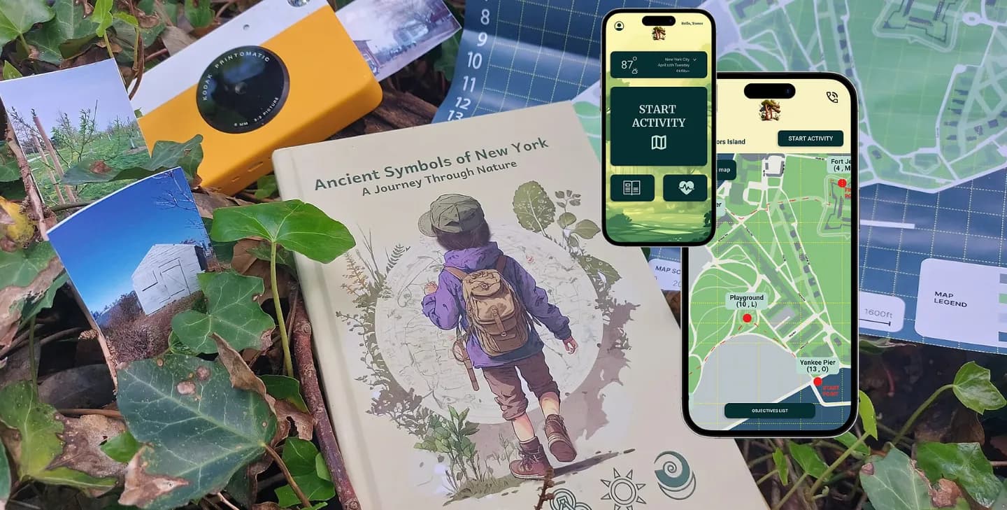
Children growing up in cities are increasingly disconnected from nature, a trend researchers link to rising anxiety, lower wellbeing, and what is called biophobia: the progression from unfamiliarity with nature into active avoidance of it. For my solo capstone at Pratt Institute I designed a two-part product system to address it: a physical activity book for children and a companion mobile app for parents. The goal was to make outdoor exploration in urban parks feel accessible, safe and genuinely fun for both.
Challenge
The problem was not simply that children were not going outside. It was a two-sided friction. Children lacked a compelling reason to choose unstructured outdoor time over screens. Parents, especially urban-raised ones, lacked the confidence and information to facilitate it comfortably. Any solution addressing only one side would fail in practice.
The constraints were real: a three-month solo timeline covering research, concept, UX and visual design; no client and no deployment context, so everything had to be validated through primary research; young children as a target user, who are among the hardest demographics to test with directly; and a need to work within the reality of urban parks rather than idealised natural environments.
What I did
I chose the medium deliberately rather than by default. A physical book for children, to force disconnection from screens, a familiar medium requiring no additional device. An app for parents, because they carry their phones anyway, and because it allowed health tracker integration without asking anyone to adopt a new behaviour.
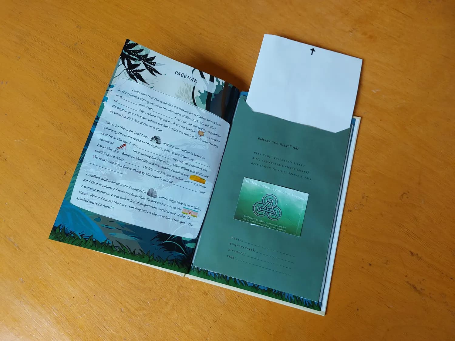
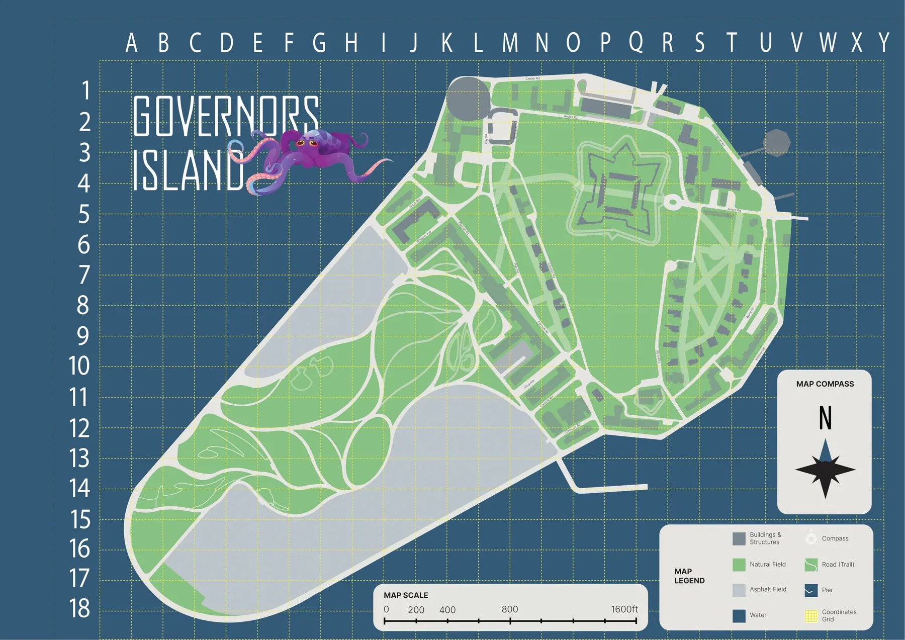
I ran primary research before committing to the concept. Personas were built from actual interviews rather than invented. I tested with 10+ parents of age-relevant children across two rounds. The key finding contradicted my starting assumption directly: parents wanted simplicity and control, not information density.
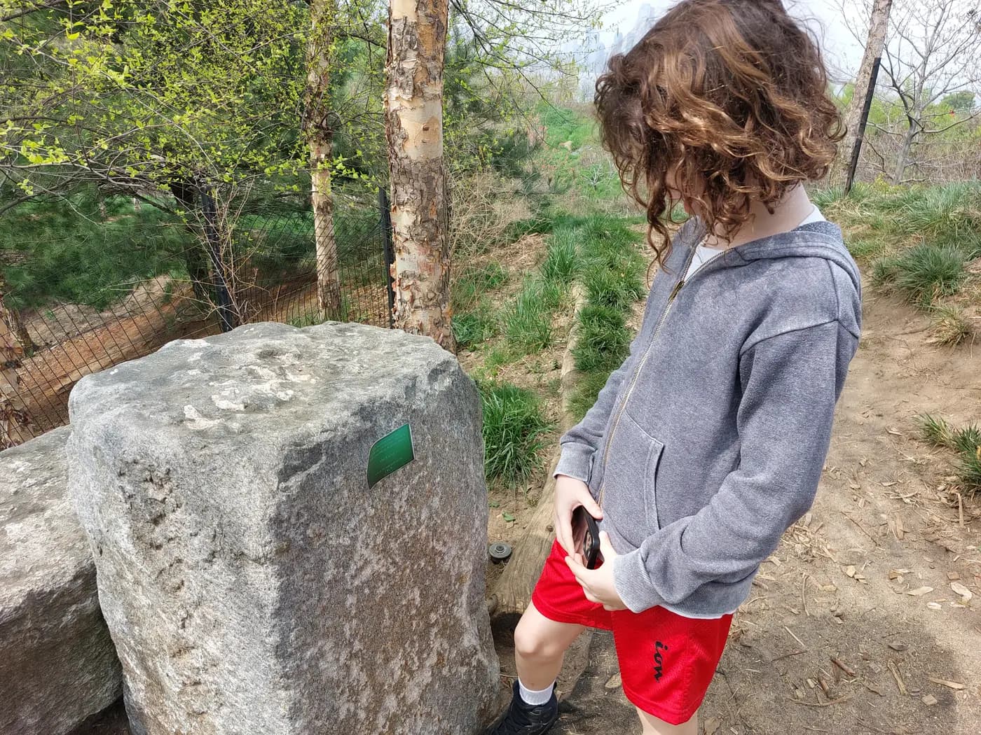
I ran two rounds of testing with real users, and both changed the product. Concept testing moved health app integration out of settings and onto the main screen. Usability testing triggered a full onboarding redesign, eliminating the landing screen for returning users, and restructured the homepage to centre the activity.
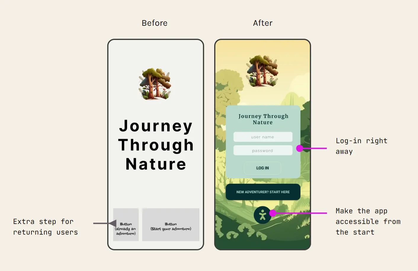
One piece of feedback was worth more than the rest. A visually impaired parent in the second round flagged a jarring mid-flow visual shift that I had not registered as a problem at all. It led to a consistent visual system throughout, a structural revision rather than a cosmetic patch.
I made a deliberate scope tradeoff. Three months, working alone. I prioritised validated UX over visual polish. The aesthetics are the weakest part of the project; the interaction model is the part that was pressure-tested against real people.
Outcome
This was a school project with no live deployment and no long-term usage data. What I can speak to honestly:
- The final product was tested with real parents and a child, and the core flows worked as intended, with no major usability failures in the final round.
- The dual-product structure was validated as conceptually coherent by users. Parents understood their role, and the book's adventure framing engaged children.
- The accessibility issue that parent raised led to a meaningful design revision rather than a cosmetic fix.
Learning and reflection
Hard-to-reach users require early planning. Testing with children is logistically difficult. I got real parent data, but direct child testing was limited. In a real product context I would build user access pipelines before the design phase starts, not during it.
My own assumptions about behaviour were wrong. I assumed parents would prioritise information density. They wanted control and simplicity. The homepage redesign came directly from dropping that assumption and watching how people actually navigated.
Empathy does not substitute for lived experience. I thought I understood accessibility needs going in. That feedback proved I did not, and not because I lacked empathy. I had not spent time with someone navigating a product under those conditions. That gap closes through direct exposure, not research alone.